Following our recent examination of Labor’s party branding, In my position as Senior Designer at Cannings Purple, Jamie Wilkinson and I investigate the roles that branding has played in the Liberal Party over the past five decades:

Video Notes:
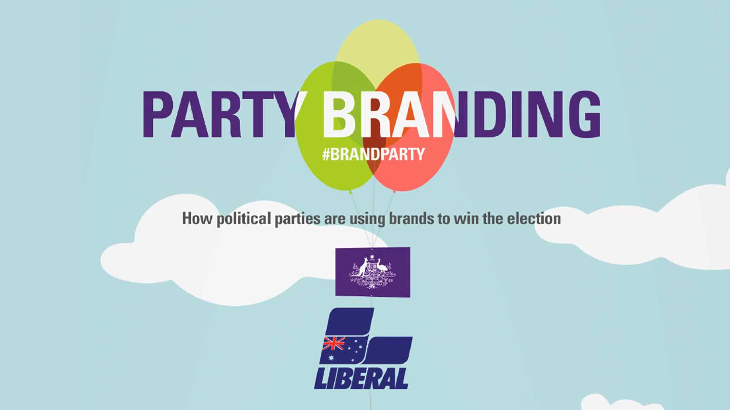
Welcome to Party Branding, where here in the Cannings Purple take a look at Australian Political branding over the last five decades.
Welcome and thanks for watching. This week, we’re taking a look at the Australian Liberal party.
1970s Liberal Branding
The modern idea of branding had not yet reached the Australian Liberal Party in the early 1970s. Possibly they had a logo, but hours of searching through archive photos libraries do not reveal a logo used anywhere, in their marketing collateral, or in photos.
This, however, does not mean they did not have a brand. It was just not unified or consistent, at least on a campaign front. It was just a bit… Gunn ho. (sorry) Here we see a poster from 1970 for David Gunn. And a decidedly different looking selection of flyers from 1975 still with no logo or consistent branding.
The first time we see some form of consistency in branding is this bumper sticker from 1975, and on the back of a young and spritely Alan Jones’ flyer from 1977. So it seems that by the mid 70s, the Liberal Party had the beginnings of a look for their collateral. Although it was piecemeal in its use at best.
The early 1970s saw a plethora of leaders come and go. John Gorton resigned as Prime Minister in 1971 and was succeded by William McMahon – who lost the 1972 election to Labor’s brand powerhouse: Gough Whitlam and the ‘It’s Time’ campaign. The Liberals were hopelessly out branded in this campaign. Their response to the “It’s time” campaign was… Wait for it… “Not yet” although they also used “Right today. Right for your future.” Not surprisingly, they lost that election emphatically. But they learned from their errors. In the 1975 election, they launched their
“Turn on the lights” campaign videos, copying the celebrity filled Labor brand strategy from the previous election – complete with Peter Brock; but without the personal focus on their leader, Malcolm Fraser. The anti Labor slogan “This is the mess we’re going to clear up“ and “Think again. Vote Liberal. Your future depends on it” appealed to disillusioned Labor voters, and also perhaps the governor general.
Malcolm also went onto win the last election of the decade, with slogans such as; “Liberal, doing the job” and “Let’s never forget”.
1980s Liberal Branding
In 1980, we see the first images of the modern Liberal logo appear. And aside from occasionally tweaking the colours, the brand has remained largely unchanged for over three decades. The iconic bold, condensed slanted text in capitals with L shaped blocks– depict a brand that is moving forwards, Australia moving forwards. It is strong, solid and serious with an emphasis on leadership.
In this 1980 photograph of Malcolm Fraser’s policy speech, it fits very well with the “lead on liberal” headline used to win the 1980 election. Fraser’s unpopular austerity measures made them unpopular however, and many gave this new brand the bird. I was unable to find out if indeed Graft did get a go, but I would hate to be the one to tell him that the voters wouldn’t.
For the most part though, it was a brave new branding era, full of youthful exuberance, ill fitting hats high wasted jeans and a decidedly more Americanised political brand.
In 1983, it was another matter however. Liberal ran with the slogans “We’re not waiting for the world” but were defeated by Bob Hawke, and began a twelve year exile from power. Andrew peacock and John Howard battled over the leadership of the party, while slogans during this period included,
- “‘Stand up for your family. Vote Liberal’ ,
- ‘Get in front again’ and
- ‘Incentivisation’ (whatever that meant).
One of Australia’s Best known copyrighters, in a Canberra Times article, stated that he thought “Masturbation would be [a] more suitable [slogan]. It’s a waste of time too.” It didn’t go down too well as a slogan, and Australians were unconvinced.
Perhaps incentivsation involved wearing funny hats? We’re still not sure.
1990s Liberal Branding
In the dawn of the 90s, it never dawned on the Liberal party to update their logo. The colour was massaged to be a darker, more prestigious blue and then left alone.
In January 1993, Hewson released his Fightback policy and video which was lambasted by the government, causing an edited release in December of the same year. Key policies like the end of bulk billing and the introduction of a GST were ultimately adopted by the party, but “the GST cake interview” probably cost Hewson the election. John Hewson lead the charge in the 1993 election with the infamous slogan” The Answer is Liberal” and his still life “Life with Keating” advertisement.
His campaign also singled out women voters, and promised to keep Medicare but was defeated and when he lost, was replaced by the political comeback king, John Howard. In 1996, they got to work with a campaign both attacking Labor and their union ties with;
- “It’s just not good enough”,
- “Labor’s got to go”,
- “enough is enough” and
- “Only a Liberal Government can free Australia’s workforce” while promoting a sense of unity with “for all of us” and “We can do it, together”.
John Howard won that election, and enjoyed a total of four victories at the ballot box. Just like the Backstreet Boys… he was back.
In the 1998 Federal election the Liberal party branding focussed on their strength, and leadership in troubled times. They lead with “For a stronger Australia” and ‘Don’t go back to Labor. Australia can’t afford it’. Although they lost some ground to Labor and One Nation – Australia, for the most part, believed them.
2000s Liberal Branding
As the saying goes, you can’t improve on perfection. Well – at least the Liberal Party think so about their logo. There is something to be said about a brand that resists being updated. Midway through the decade, a lighter sky blue, appearing modern, light & trendy in comparison was also used.
In the 2001 election, the liberals placed their brand as the economy experts. The Liberals also took their campaign online. They created a series of micro-sites, the first of which attacked Kim Beazley for his “flip flops” on policy as well as again attacking the Labor Union connection and the confusing Knowledge Nation policy.
Slogans such as “Keep Australia in Safe Hands” and “Heading in the Right direction” were used in this campaign. Three years later, against a Latham lead opposition in 2004, The government targeted both Latham’s lack of experience, and Labor’s recent history with;
- ‘Don’t take the risk’,
- ‘Latham will squeeze the fees’,
- ‘Protecting, securing, building Australia’s Future’, and
- ‘The Howard Government delivers’.
The big moment of the naughties was the Kevin07 Campaign of 2007. The Liberals tried to position their branding as “experienced leadership” but ended up being seen as “old leadership”, when compared to the Kevin Rudd brand. Using the slogans “Australia’s choice” and “Don’t risk Rudd” they once again attempted to position Labor as “inexperienced” – but it just didn’t work. Australia were ready for change. And just three years later… so were the Labor party.
Of note in this decade is Malcolm Turnbull’s first tweet from Twitter; the earliest Australian political party leader to do so. The age of the social media campaign had begun.
2010s Liberal Branding
2010 arrived, Kevin Rudd departed, Julia Gillard got a promotion and the Liberal logo remained relatively unchanged; a rock in the tempestuous waters of political change.
But it was submerged rock in almost all collateral from both their 2010 and 2013 election campaigns. It’s missing and is instead replaced with “Our Action Contract”, a legal looking document that seemingly tried to avoid featuring the unpopular Tony Abbott, save only in name and signature.
They also focussed on the instability of the Federal and State Labor governments particularly on the ALP border policy. The Liberal strategy seemed to involve a lot of slogans.
- ‘Stand up for real action’,
- ‘Our action contract’,
- ‘We can’t afford more Labor’,
- ‘Stop the boats’ and
- ‘End the waste, pay back the debt, stop the big new taxes, stop the boats’.
Someone in the Liberal party also thought that it was a good idea to print fake Greens voting advice cards. We just hope they used recycled paper. The Liberal campaign was as negative as the Labor one was against Tony Abbott –and although the Coalition closed the gap, it was not enough to win power.
Much like John Snow, Kevin Rudd came back from the dead to lead Labor’s Watch in the 2013 election. As well as using Labor’s instability against them, Liberals used some slogans from the previous campaign as well as ‘Choose real change’ ‘A stronger Australia, a better future’.
According to some sources, Labor’s campaign was over 75% negative messaging, compared to only 44% negative messaging for the Liberals.
A brand that spends it’s time attacking it’s competitors is a risky gamble, and the coalition scrambled over the line won the 2013 election.
Liberal Branding: This 2016 Election
A change is as good as a holiday, so they say – but the Liberal logo hasn’t taken a break in over three and a half decades. The Liberal campaign is predominantly a positive one and that is probably a good branding tactic. It’s certainly a relief from the negativity of the last two campaigns.
The Liberal website is interesting, a very different strategy to that of Labor’s. They’ve imitated the modern look of the Greens recent branding – and focussed completely on Australian industry, landscapes for their imagery. The imagery is somewhat lacking in people and faces, but emotive and quite beautiful for an election campaign.
Slogans seen have been “back our plan for a strong new economy” – positioning the Liberal Party as innovative. The use of the word “New” here is critical.
Their campaign goes back to the use of a stamp or crest; it looks very official and almost legally binding. A similar strategy to the losing 2010 campaign – but with a different leader, will it share the same fate? Over all, it’s a different approach to the Labor one – and perhaps marginally better, but time will tell.
Considering that the Labor brand is leaning heavily on the person of Bill Shorten, Liberals have also released a campaign attacking his integrity.
Will Australia buy the Liberal brand promises? Is it convincing? Good branding only sells a bad product once, and Australia are still left with a bad taste in their mouth after the unpopularity of Tony Abbott.
But Liberal brand is about policies over personality. They’ve never been big on promoting their leaders, relying on the solidity, longevity and consistency of their own brand, instead of leveraging the popularity of their leader.
We don’t see much of the Liberal logo in this election branding; although It’s a testament to the original branding team that the Liberal logo still works today. Originating as a progressive brand, they have instead progressed into a conservative one; and in the process, distancing at least one of their founding fathers. In a world increasingly focussed on innovation and change, how does an increasingly conservative and change resistant brand package itself to appeal to the public? I suppose it depends on where we are progressing towards.
Can this Liberal brand convince a skeptical Australia to trust it for a second term, or will they become road kill underneath the Bill Shorten’s Labor brand bus? Australia waits to vote and find out.
Thanks for watching! The team at Cannings Purple have enjoyed creating these looks at our major political parties and their brands.
Designed Researched by Adam Elovalis. Produced by Adam Elovalis and Jamie Wilkinson. Voiceover by Jamie Wilkinson.
First Published at Cannings Purple.