Brief
In 2014 a mid-sized Australian copper and nickel mining company needed to rebrand. I was responsible for the visual brand.
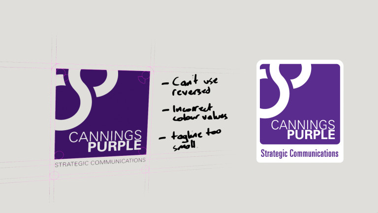
The solution
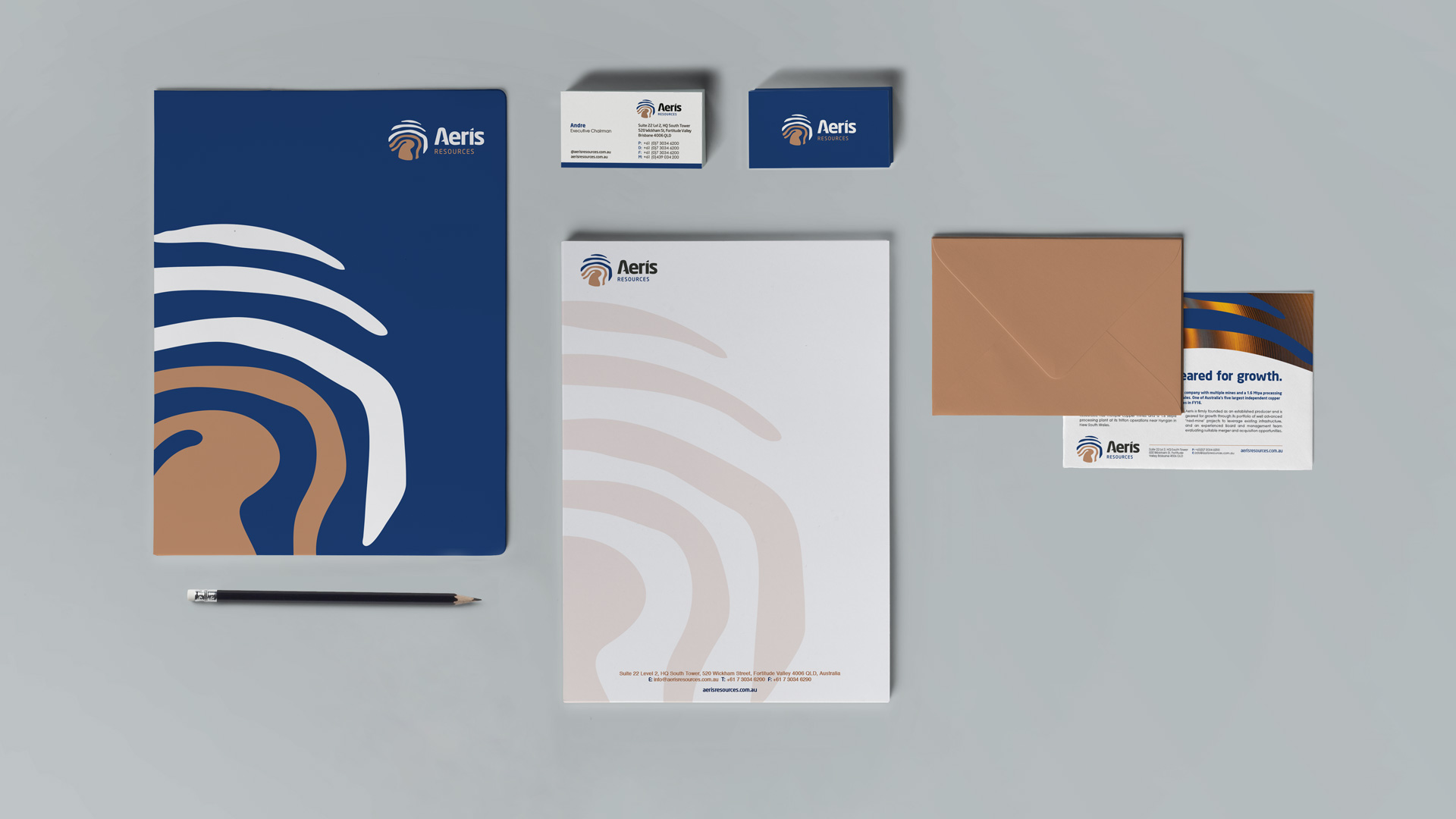
The new brand needed to be progressive, forward-facing and modern. We linked the logo of the new brand with copper and used nearby cave paintings as inspiration for a logo that spoke of sky and earth, progress and growth. We developed the brand from the ground up, and at almost a decade old, it has stood the test of time. This was one of my first rebranding projects.
My role
- Visual brand strategy and execution
- Naming ideation
- Logo design
- Stationery design
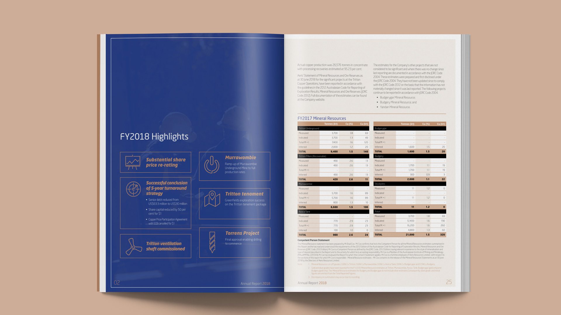
- Annual report design
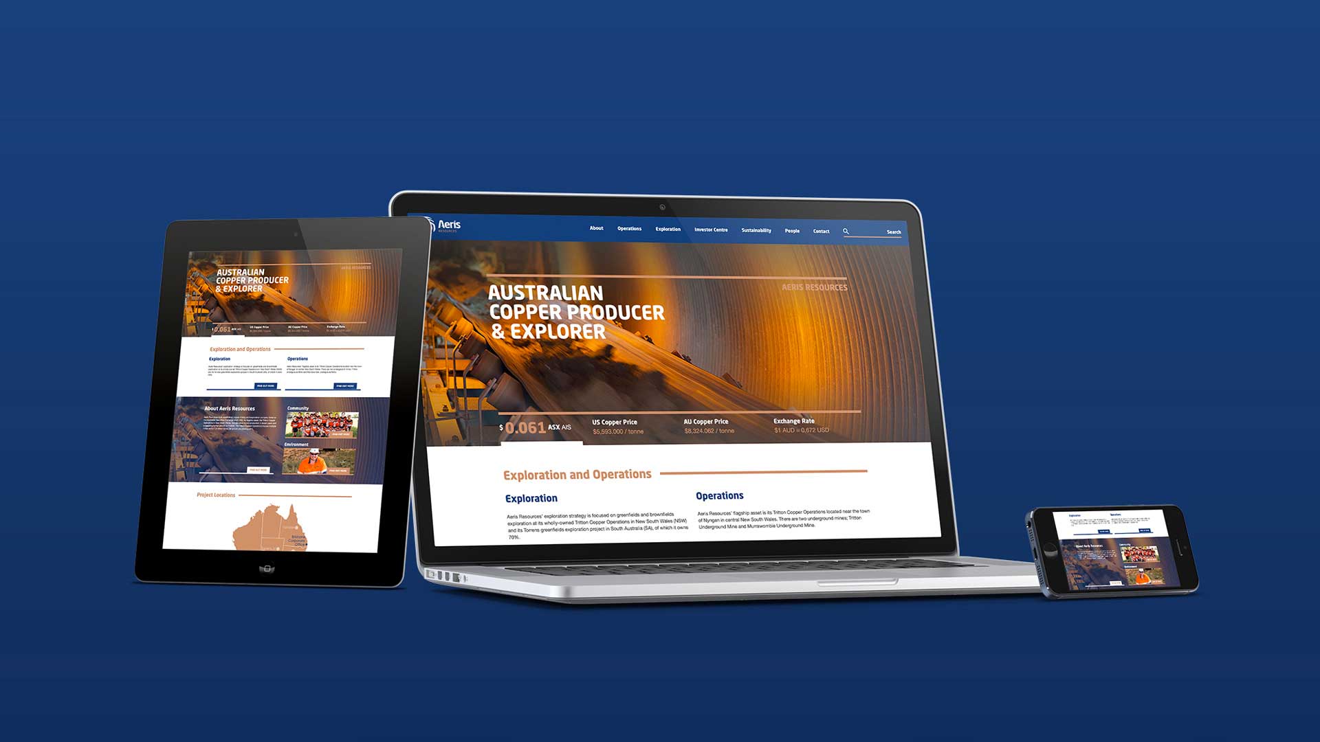
- Website design
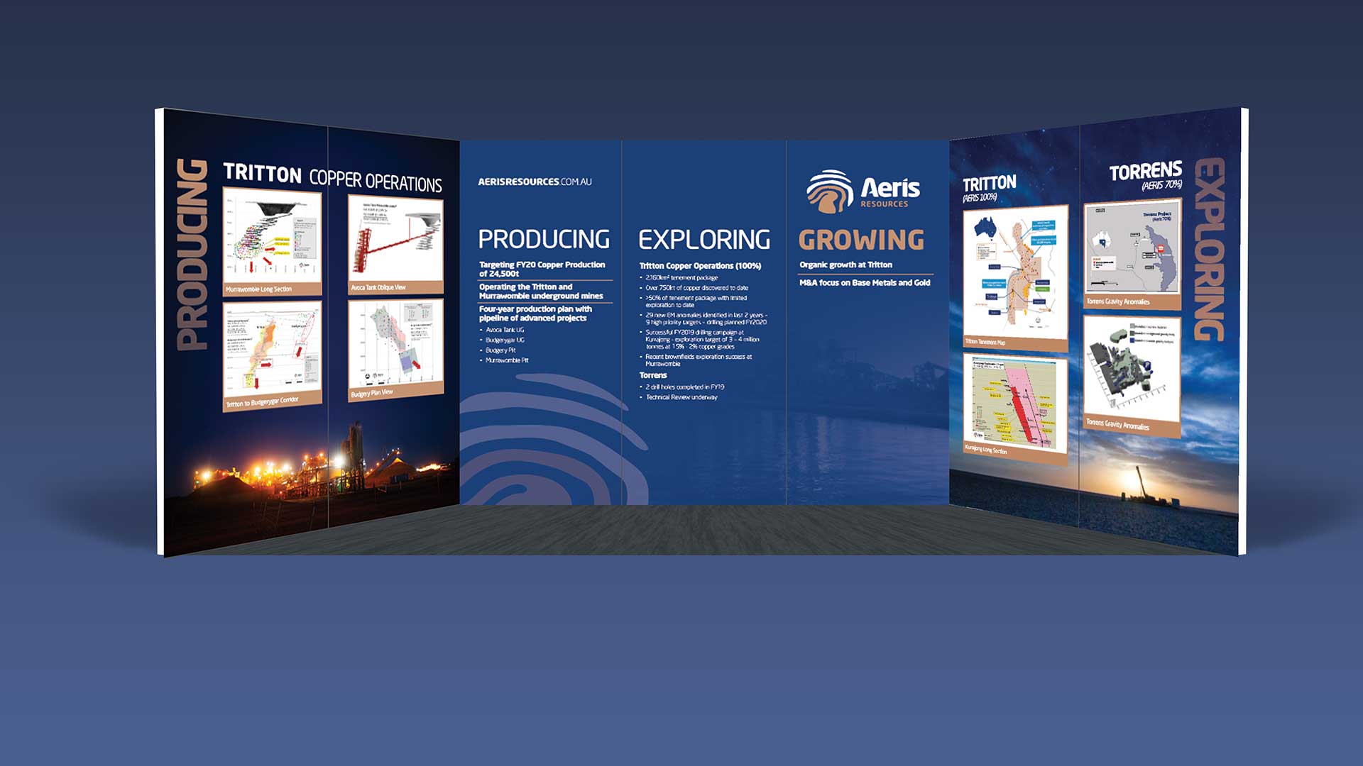
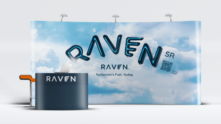
- Booth design
- Banner design
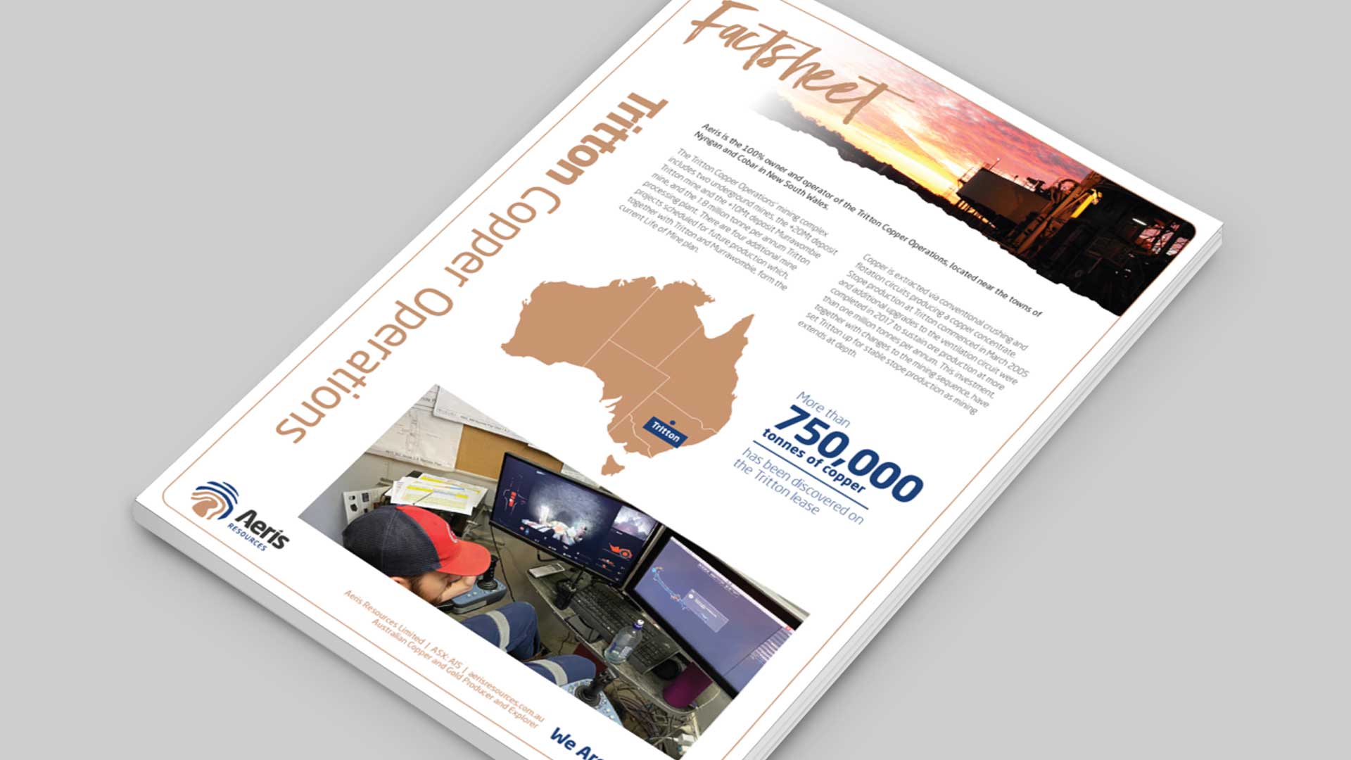
- Fact-sheet design
- Video bumpers
- Social-media templates
- Magazine & newspaper advertising
- Model-car branding
Annual report design sample.